Filip Puzyr - Website
Responsiveness

Client: Filip Puzyr
Year: 2023
Key to the modern online world
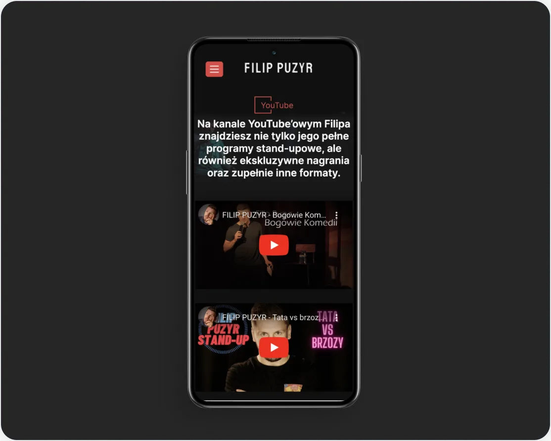
In today's digital landscape, website responsiveness is a crucial element of modern design. Whether you're using a computer or smartphone, the mobile view with YouTube integration ensures easy navigation, aesthetic appeal, and access to the latest performances. This confirms that the website adapts seamlessly to various devices, enhancing the comfort of viewing and interacting with content.
The role of responsiveness: Why it matters?
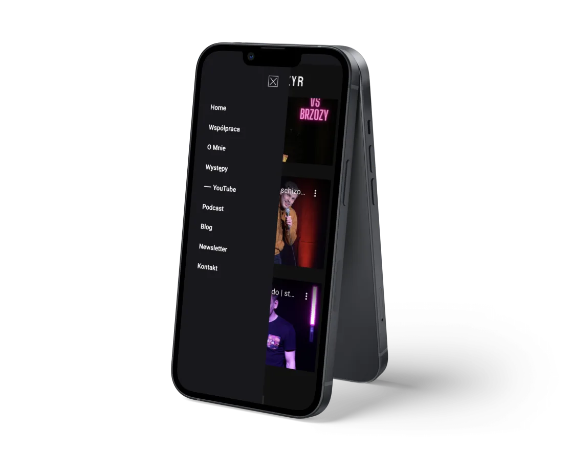
esponsiveness goes beyond mere content adaptation; it embodies flexibility and adaptability—key components for success in today's multi-device landscape. Filip Puzyr's website exemplifies this concept through its mobile menu, where seamless navigation and intuitiveness hold the same importance as they do on larger screens. This underscores the website's ability to flawlessly adjust to various devices, delivering a distinctive and user-friendly experience for mobile users.

Tools supporting responsiveness
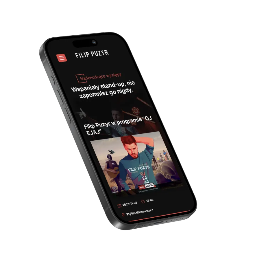
Responsive design is not just about creativity but also about tools and technologies. Adaptive frameworks like Bootstrap or Foundation provide ready-made solutions, speeding up the design process. A/B tests adjust the strategy to user preferences. Tools such as Google PageSpeed Insights help optimize responsiveness. This is particularly evident in the integration with the 'Buy a Ticket' portal on Filip Puzyr's website, where responsiveness facilitates convenient and quick ticket purchases for his performances via phone.

Pros and cons of approaches
Introducing responsiveness comes with certain challenges, such as initial financial and time investments. However, the long-term value lies in increased reach, improved user experience, and more effective marketing campaigns.
Financial benefits
Responsive websites may require a higher initial investment but provide long-term savings. They eliminate the need to maintain multiple separate versions of the site, resulting in lower maintenance costs.
Practices for accessibility and responsive design
Responsible responsive design also considers accessibility for individuals with disabilities. Implementing semantic HTML tags, accessible labels for screen readers, and using large, readable fonts are practices that enhance content accessibility.
Responsive design for Web vs. Mobile
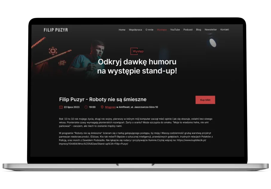
While there are similarities, such as brand consistency, each screen format seems to emphasize different elements. Mobile sites focus on optimized navigation tailored for small screens. Tablets offer a balance between intuitive navigation and content presentation, while desktops prioritize comprehensive content display and multi-dimensional navigation.
Where to begin: Mobile-first approach
Starting design from mobile devices and then expanding versions for larger screens is a strategy that ensures the most intuitive and efficient user experience.
Techniques supporting responsiveness
Utilizing techniques like flexbox and grid layout, lazy loading, and fluid typography are key elements of responsive design.
Summary
Responsiveness is not just a trendy addition to a project; it's a fundamental element that adapts our websites to the ever-changing reality of the online world. It's an investment in the future, where user expectations will grow, and the diversity of devices will only increase. Implementing responsiveness is not just a technical step; it's a strategy that builds a bridge between the brand and the user, providing unforgettable online experiences.
More case studies
All case studies


This project was delivered as part of our Web & Mobile App Development work.