How Heatmap Analysis Increased E-Commerce Sales by 33%
An online drugstore was underperforming its physical locations. Customers visiting the brick-and-mortar shops bought an average of 6 products per visit. Online shoppers? Just 4. We ran a heatmap analysis across the entire e-commerce funnel, identified the exact friction points killing conversions, and redesigned the cart experience. The result: a 33% increase in completed sales, confirmed through A/B testing over 6 weeks.
Here is the full breakdown of what we found, what we changed, and why it worked.
The Problem: Why Online Shoppers Were Buying Less
Before touching any heatmap tool, we needed to understand the gap. Our UX audit compared the physical and digital shopping experiences side by side. The numbers told a clear story:
Physical store: Average basket of 38.99 PLN across 6 products. Online store: Average basket of 34.99 PLN across 4 products.
That is a 30% drop in items per transaction. The products were the same. The prices were the same. The difference was the experience.
The physical store had something the website did not: a visible, tactile cart. You pick up a product, drop it in a basket, and you see it there. Every item you add reinforces the buying behavior. Online, clicking "Add to Cart" sent products into a small icon in the header. No confirmation. No feedback. No visible proof that anything happened.
The UX audit also revealed a broader issue. The website had too many categories, too many filters, and too many promotional banners competing for attention. According to Baymard Institute research, 18% of users abandon carts because the checkout process is too complicated. Our client's site had a version of this problem, but it started earlier, right at the "add to cart" moment.
We needed quantitative data to confirm these hypotheses. That is where heatmap analysis came in.
Setting Up Heatmap Tracking
We deployed Hotjar across four page types:
Category pages (12 total, covering all major product groups) Product detail pages (sampled: top 50 by traffic) Cart page Checkout flow (3 steps: shipping, payment, confirmation)
For each page type, we collected three data layers:
Click maps showing where users tapped or clicked. This tells you what people try to interact with, including elements that are not clickable.
Scroll maps showing how far down the page users scrolled before leaving. Critical for understanding whether key content (like the "Add to Cart" button on longer product pages) was even seen.
Session recordings providing qualitative context. Numbers tell you what happened. Recordings tell you why.
We ran the tracking for 4 weeks, collecting data from over 14,000 unique sessions. That sample size gave us statistical confidence across all page types, even the lower-traffic checkout steps.
One thing we did not do: change anything on the site during data collection. This is a common mistake in e-commerce heatmap analysis. If you adjust layouts or copy while collecting heatmap data, you contaminate the baseline. We needed a clean picture of current behavior before proposing any changes.

What the Heatmap Data Revealed
Four findings stood out. Each one pointed to a specific, fixable problem.
Finding 1: Repeated "Add to Cart" Clicks Without Feedback
This was the most significant discovery. On product detail pages, the click map showed unusually high click density on the "Add to Cart" button. Not the kind of density you see with a popular, well-placed CTA. The wrong kind: multiple rapid clicks from the same user sessions.
Session recordings confirmed it. Users were clicking "Add to Cart," seeing no visual change, and clicking again. Some clicked 3 or 4 times. They were not adding multiple units. They were uncertain whether the first click worked.
The button had no state change on click. No color shift, no animation, no "Added!" confirmation. The only feedback was a tiny number incrementing on the cart icon in the header, which most users never noticed.
This maps directly to a core UX design principle: the feedback principle. Every user action needs an immediate, visible system response. Without it, users lose confidence in the interface. In our case, they either abandoned the product page or (worse) assumed nothing was added and moved on, resulting in smaller carts.
Finding 2: Cart Icon in the Header Was Nearly Invisible
The scroll map and click map data for the site header told a consistent story across all page types: the cart icon received almost no interaction. On category pages, the click rate on the cart icon was under 0.3% of total page clicks.
This was not because users did not want to check their cart. Session recordings showed users scrolling up and down, visibly looking for their cart contents. The icon was small (24x24px), used a thin-line style that blended into the navigation, and displayed no item count until something was added.
Compare this to the Von Restorff effect, which states that items visually distinct from their surroundings are more likely to be noticed and remembered. The cart icon was designed to match the navigation aesthetic. It should have been designed to stand out from it.
Finding 3: Promotional Banners Were Eating Attention
The category page heatmaps revealed a pattern we see often in e-commerce CRO projects: promotional banners at the top of the page captured a disproportionate share of user attention.
Three rotating banners occupied the top 400px of every category page. Click map data showed 34% of all category page clicks went to these banners. Meanwhile, the product filter sidebar (which should help users find what they need faster) received just 8% of clicks.
This aligned with findings from our persona-based cognitive walkthrough. Anna, our primary persona (a 35-year-old mother shopping for household and baby products), had to scroll past promotional content to reach actual product listings. When she needed baby food, she had to figure out whether it lived under "Food" or "Mom and Baby," with no help from the promotional banners that dominated her screen.
Finding 4: Checkout Form Abandonment at the Shipping Step
Scroll maps on the checkout flow showed a sharp drop-off at the shipping information step. 62% of users who entered checkout completed the shipping form. But NNGroup research on checkout usability suggests that well-designed flows should retain 75%+ through shipping.
Session recordings showed users pausing at the shipping cost reveal. The shipping price appeared only after filling in the address, a pattern that Baymard's checkout research identifies as a top-3 cause of checkout abandonment.

The Hypothesis: Always-Visible Cart With Clear Feedback
Based on the four findings, we built a focused hypothesis:
If we make the cart visible, interactive, and responsive to every user action, online shoppers will add more items and complete more purchases.
The redesign had three components:
1. Button state change on "Add to Cart"
When clicked, the button now shifts from its default state to a green "Added!" confirmation for 2 seconds, then returns to default. This provides the immediate feedback that was missing. No ambiguity about whether the click registered.
2. Mini cart drawer animation
After clicking "Add to Cart," a slide-in drawer appears from the right side of the screen. It shows the item just added, the current cart total, item count, and a "View Cart" / "Continue Shopping" choice. The drawer auto-closes after 4 seconds if the user takes no action.
This mimics the physical shopping experience. You put something in your basket, you see it in your basket. The translation to digital needed to be explicit, not implied by a tiny icon update in the header.
3. Persistent cart summary on scroll
On product and category pages, a sticky mini-bar appears at the bottom of the screen once the cart has at least one item. It shows the item count and total price, and expands on tap. This keeps the cart visible throughout the browsing session, similar to how you can always glance at your physical basket while walking through a store.
These changes were informed by patterns documented in our work on mobile app UX, where persistent navigation and clear touch targets directly impact conversion. The same principles apply to e-commerce on any device.
A/B Testing the Cart Redesign
We did not ship the redesign to all users immediately. The heatmap analysis gave us confidence in the problem. The A/B test would give us confidence in the solution.
Test setup:
Control (A): Original cart experience. No button feedback, header-only cart icon, no mini drawer. Variant (B): Redesigned cart with button state change, mini cart drawer, and persistent cart summary.
Traffic split: 50/50 random allocation Duration: 6 weeks Sample: 22,000+ sessions per variant (44,000+ total) Primary metric: Completed purchases (not just "add to cart" events) Secondary metrics: Average cart value, items per cart, cart page visit rate, cart abandonment rate
We chose completed purchases as the primary metric because it captures the full funnel impact. An "add to cart" increase means nothing if users still abandon at checkout. We wanted to measure whether the entire chain improved.
The test ran without any other site changes during the 6-week window. No promotions, no pricing adjustments, no layout changes outside the cart experience.
Results: 33% More Completed Sales
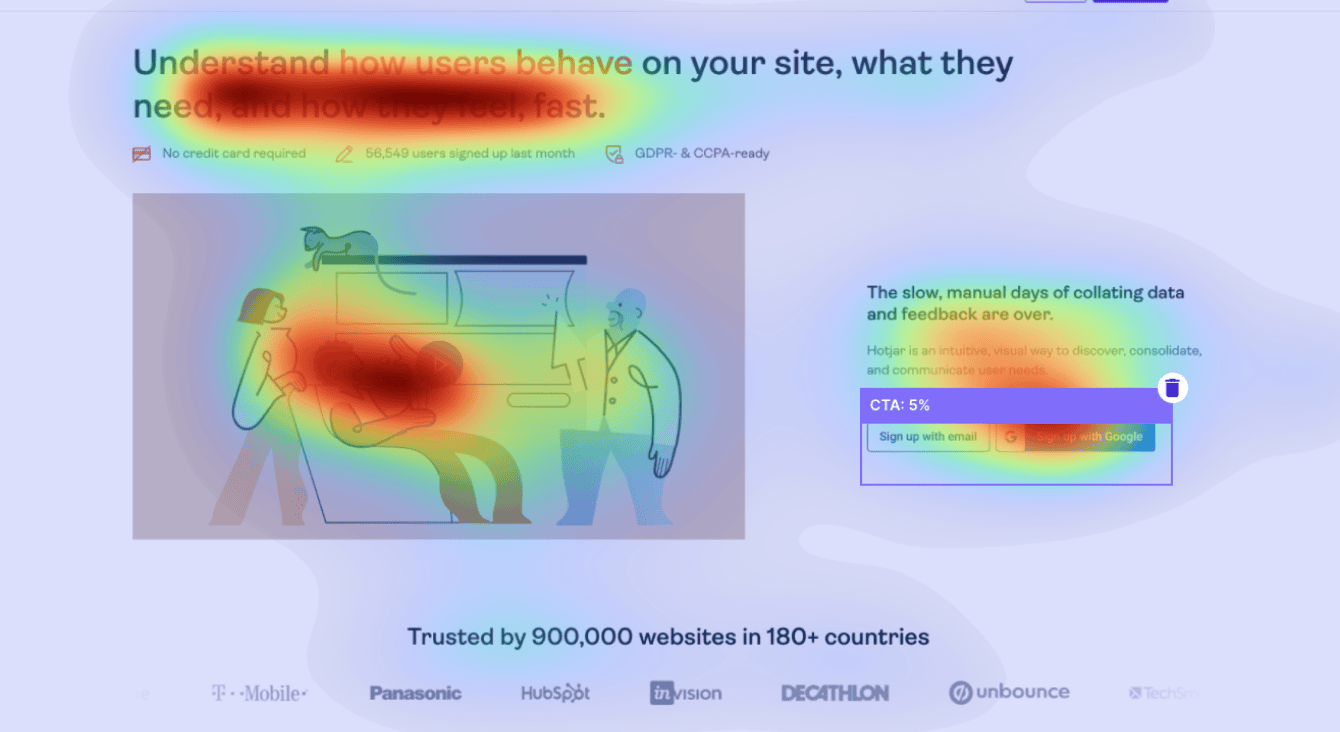
The variant outperformed the control across every metric.
Completed purchases: +33%
This was the headline number. Users who experienced the redesigned cart completed purchases at a rate 33% higher than the control group. The improvement was statistically significant at p < 0.01, confirmed by week 4 and sustained through week 6.
Items per cart: +22%
The average number of items per completed cart increased from 4.1 to 5.0. This brought the online experience closer to the physical store benchmark of 6 items. The mini cart drawer made it easy for users to see what they had and keep shopping, rather than wondering if their items were "saved."
Cart page visit rate: +41%
More users visited the cart page in the variant group, which indicates higher engagement with the cart itself. The mini drawer served as a bridge: users saw their items, then clicked through to the full cart to review before checkout.
Cart abandonment rate: -18%
Among users who reached the cart page, 18% fewer abandoned before completing checkout. The persistent visibility of cart contents reduced the "sticker shock" moment. Users already knew what they were paying for.
These results align with conversion rate optimization benchmarks from CXL Institute, which reports that cart visibility and clear feedback are among the highest-impact changes for e-commerce checkout optimization.
What We Learned: Heatmap Analysis Best Practices for E-Commerce
This project reinforced several principles that apply to any e-commerce CRO project using heatmaps.
Combine quantitative and qualitative data. Click maps and scroll maps show what users do. Session recordings show why. We would not have identified the "repeated click" problem from click maps alone. The density looked like strong engagement. Only session recordings revealed it was confusion.
Do not redesign without a baseline. Four weeks of clean data collection before any changes gave us a reliable comparison point. We see teams skip this step and end up unable to measure the impact of their changes.
A/B test before full rollout. The heatmap data pointed to a problem. Our hypothesis proposed a solution. But hypotheses are not results. The 6-week A/B test with 44,000+ sessions gave us confidence that the improvement was real, not a fluke of seasonal traffic or a novelty effect.
Use persona-based walkthroughs to interpret heatmap data. Heatmaps show aggregate behavior. Personas help you understand individual journeys. Our cognitive walkthrough with Persona Anna explained why users were ignoring the filter sidebar (too many options, unclear categories) in a way that raw click data could not.
Restructure based on user mental models, not business logic. Our tree testing study with 100 users revealed that the original category structure matched the business inventory system, not how customers think about products. After restructuring based on card sorting results, users found products 2x faster with 29% less backtracking. Heatmap data confirms the same principle: design for user behavior, not internal logic.
Use the right tools for each layer. Hotjar for heatmaps and recordings. Google Analytics for funnel analysis and traffic segmentation. Persona walkthroughs for qualitative depth. Each tool answers a different question. No single tool answers all of them.
Key Takeaways
- Heatmap analysis for e-commerce works best when combined with session recordings and persona research, not used in isolation
- The "Add to Cart" interaction is the most critical moment in the e-commerce funnel. If users are uncertain whether it worked, they buy less
- Always-visible cart elements (mini drawer, persistent summary bar) bridge the gap between physical and digital shopping experiences
- A 33% increase in completed sales came from fixing one interaction pattern, not from discounts, new products, or more traffic
- Collect 3 to 4 weeks of baseline data before making changes. Clean data is worth the wait
- A/B test every redesign with a primary metric that reflects real business outcomes (completed purchases, not clicks)
- The gap between physical store performance (6 items/cart) and online (4 items/cart) can be closed by making digital feedback as explicit as physical feedback
Get Your Free UX Validation
If your e-commerce conversion rate is not where it should be, heatmaps are the fastest way to find out why. We offer a free validation session where we review your current UX, identify the highest-impact friction points, and outline a data-driven plan to fix them.
No buzzwords. No generic recommendations. Just the specific changes that will move your numbers.
Book your free validation or see more of our case studies to see how we work.